Company
VidMob, Inc.
Project includes
Product design, design system, strategy and planning
Role
Senior designer
Years involved
2020-2022
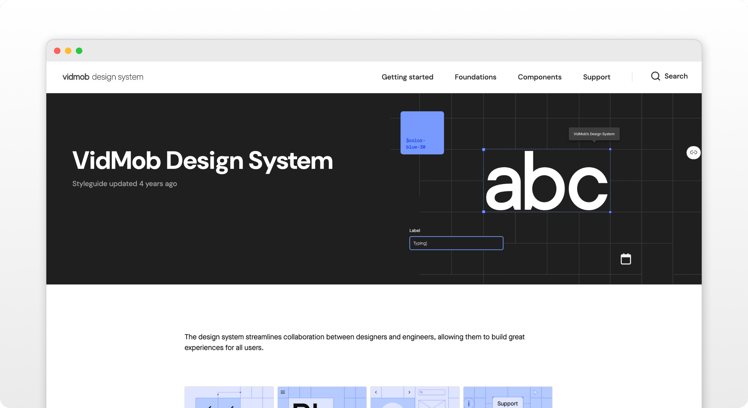
VidMob Design System
VidMob, an advertising software startup, was interested in expanding on its product organization and bringing in a design system expert to streamline the design and engineering building processes. Since a product already existed, it was a good starting base to understand what we needed from the design system.
The beginning
As this was my second design system, I had a pretty good idea of what needed to be tackled first: foundational elements. Color was a big one, and fairly controversial (what design element isn’t when you get a bunch of designers in a room together?)
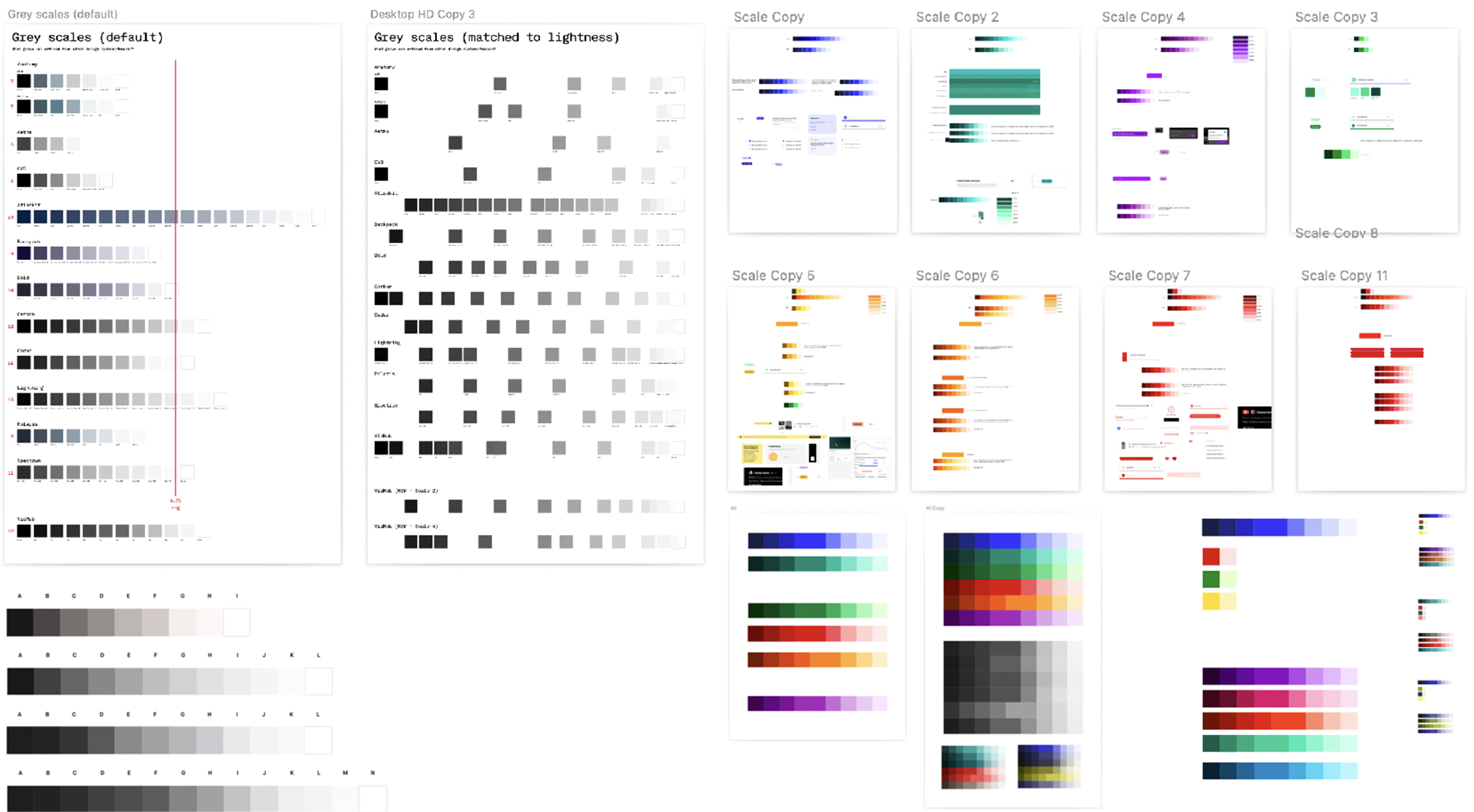
We spent a lot of time picking out our main brand color and developing that ramp. We used that as a basis for the rest of the color ramps.
One thing we spent particular time on was making sure that our ramps across the board were fairly consistent in lightness so, for example, blue-60 and red-60 had similar values of saturation. While this wasn’t perfect, it was close enough for our needs where we knew we’d have good contrast when selecting colors of different levels from different ramps.
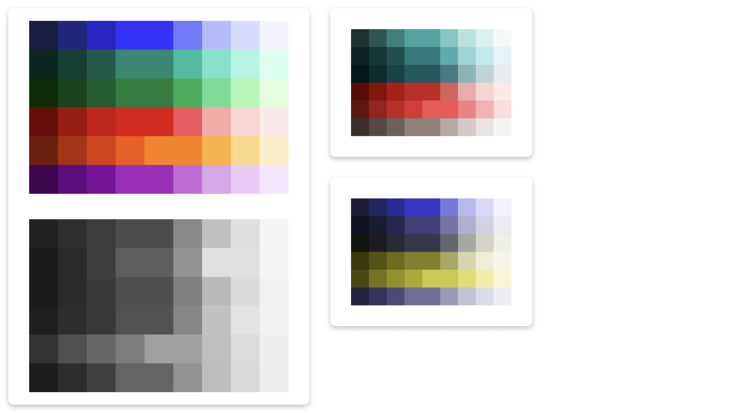
We also made sure we considered what folks with the most common color blindness would see.
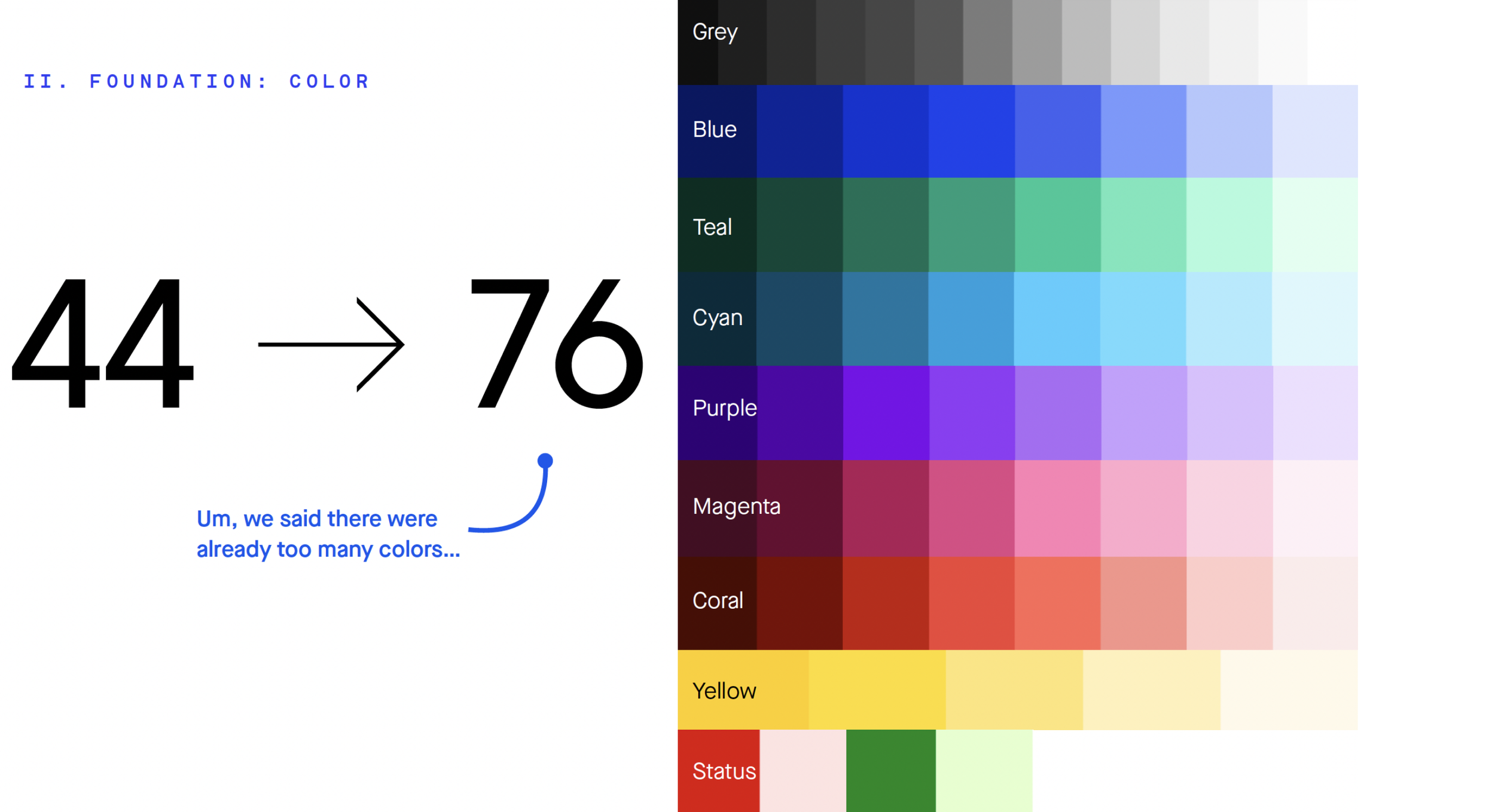
When chatting with our engineers, one thing that came up was that we had too many colors in our code. In our color work, we ended up with close to double the amount of colors from what we currently had. This of course, could have been frustrating to engineers to hear, but we assured them than it was actually better with how we were developing our token structure.
Tokens
We utilized the option/decision structure as a best practice for our token setup. While this was most prevalent in colors, it also was the default structure for anything else we made a token.
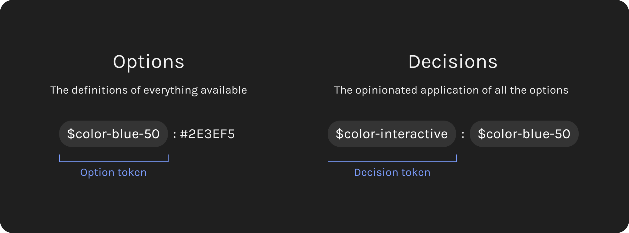
Options were all the colors, decisions were the ones used to implement designs, so engineering would only have to worry about these colors.
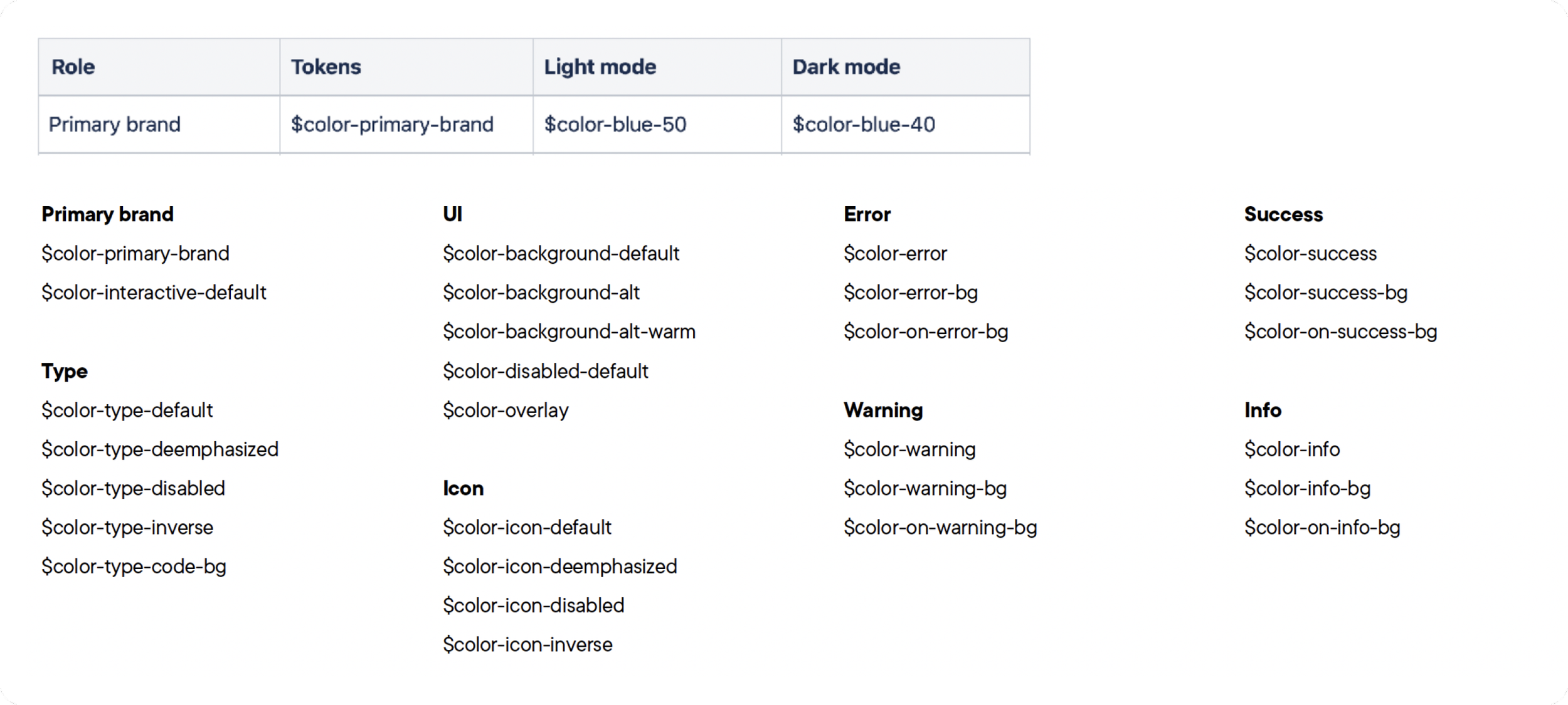
We set up our decision names in a way where anyone could come in and understand how to apply them. This would take some mental load off both designers and engineers to know how to use our colors. You don’t need to know that our main interaction color is #2E3EF5 or even $color-blue-50, you just need to apply the $color-interactive token when you’re working with something interactive.
The rest of the foundations
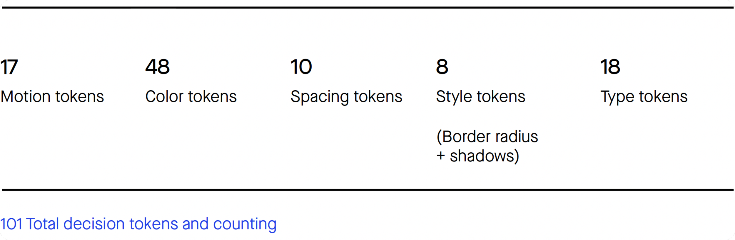
Now that we had color, we could base all of our tokens on this structure.
Spacing
Typography
Icon size
Motion
Border radius
Shadows
About a year after I started working on the VidMob Design System, we added dedicated engineers, and our production of DS elements shot into high gear.
In 6 months, we were able to get 8 components out in the code. This was quite a feat considering we had to create a new repo, refactor some of the work our engineers had tried to do between feature work, and get all the tokens set up.
Button
Checkbox
Loader
Radio
Text field
Motion
Checkbox group
Radio group
We used our first few components to set up a process for delivering components.
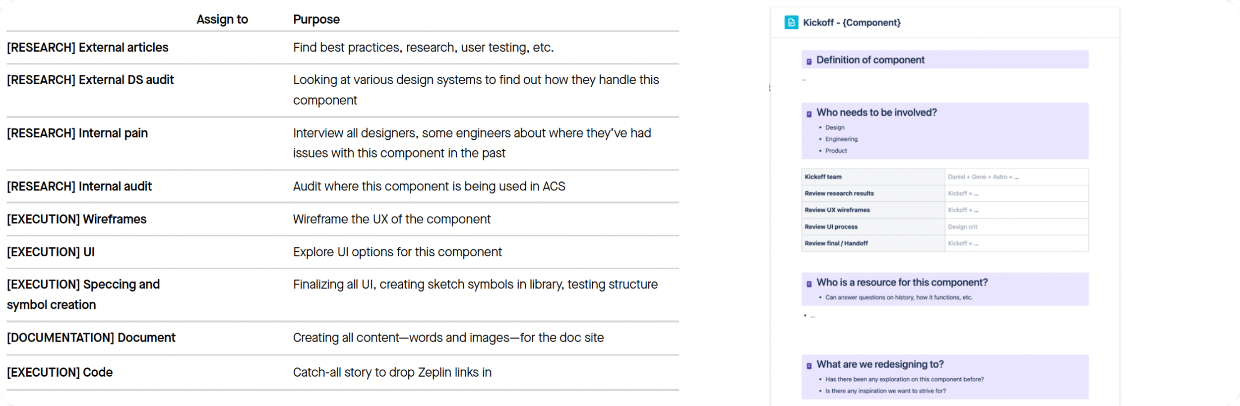
We evaluated at every component kickoff what tasks that component would need and what ones we didn’t need. Not every component needed to have every step depending on the complexity.
We also launched documentation.
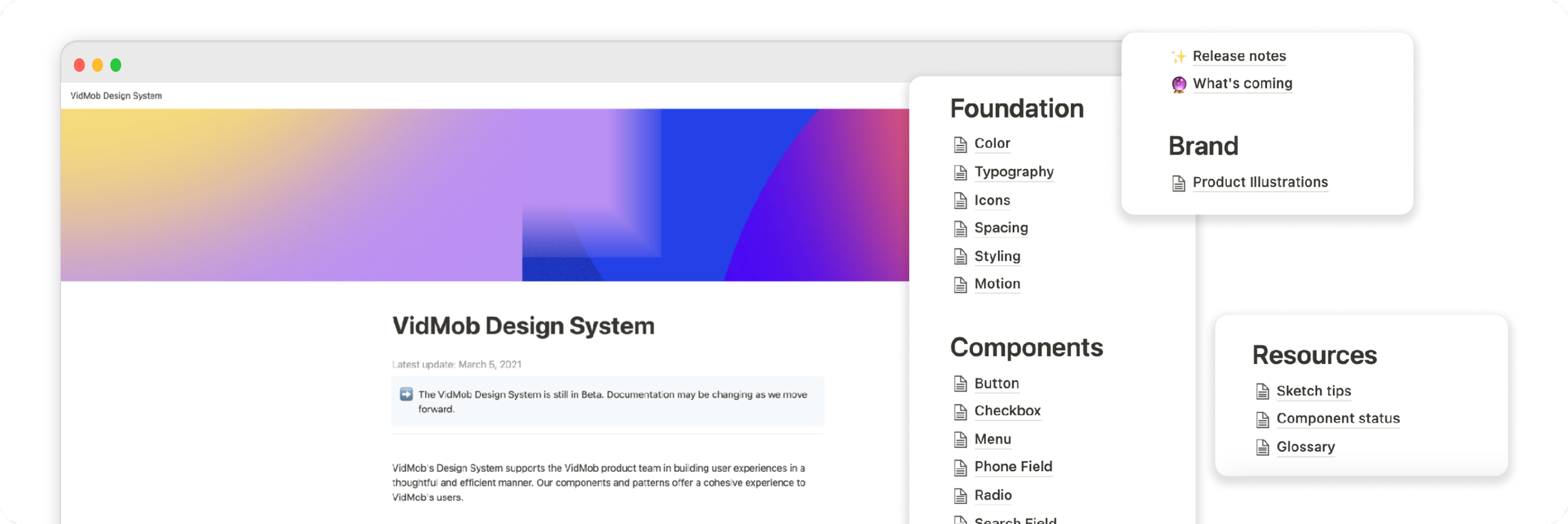
We knew we wanted public documentation and since we didn’t have resources at the time, we decided to utilize Notion’s ability to publish to the web and document the DS there for the time being.
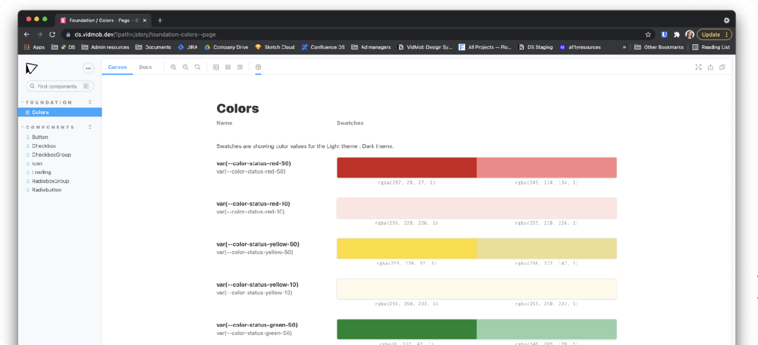
In addition to our documentation, we knew knowing what was coded was instrumental in our DS’ success, and we wanted this to be visible to both engineers and designers, so we got a Storybook instance going. This was also used to help us QA what was built.
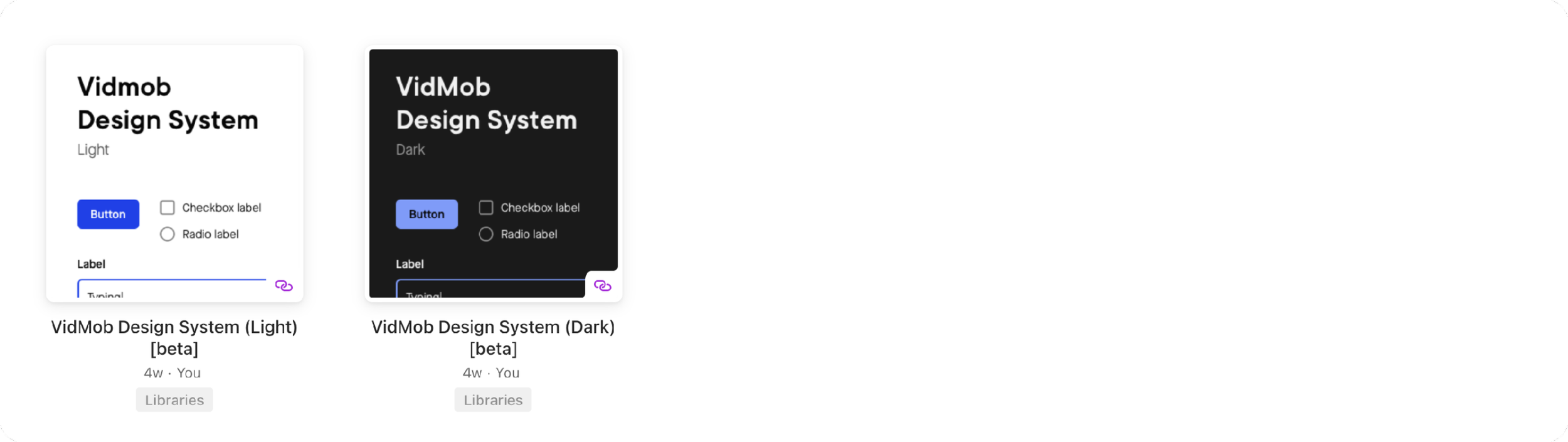
The last key piece was having a single source of truth for design to pull from, which took form in our Sketch libraries. At the time, Sketch didn’t deal with different themes easily in one file, so we figured out a way to pull in tokens from a dark theme library if we needed to show dark mode.
Establishing the design system meant VidMob now had a process and the ability to work more efficiently when delivering features.